pacman::p_load(ggdist, ggridges, ggthemes,
colorspace, tidyverse)Hands-on Exercise 4
Part 1: Visualising Distribution with R
1. Getting Started
1.1 Installing and Loading the Packages
In this section, we begin by installing and loading the necessary R packages using the pacman package, which simplifies package management by loading multiple packages at once. The key packages include:
ggdist: For advanced distribution visualization.
ggridges: For creating ridgeline plots.
ggthemes: For applying thematic styles to plots.
colorspace: For color manipulation in plots.
tidyverse: A collection of R packages designed for data science.
1.2 Data Import
This section demonstrates how to load a dataset (“Exam_data.csv”) for analysis. This dataset will be used throughout the exercise to explore distribution visualization techniques.
exam <- read_csv("data/Exam_data.csv")Rows: 322 Columns: 7
── Column specification ────────────────────────────────────────────────────────
Delimiter: ","
chr (4): ID, CLASS, GENDER, RACE
dbl (3): ENGLISH, MATHS, SCIENCE
ℹ Use `spec()` to retrieve the full column specification for this data.
ℹ Specify the column types or set `show_col_types = FALSE` to quiet this message.2 Visualising Distribution with Ridgeline Plot
2.1 Plotting ridgeline graph: ggridges method
This section uses the
ggridgespackage to create ridgeline plots, which show the distribution of English scores across different classes.Ridgeline plots are effective for visualizing distribution in a compact and comparative format.
ggplot(exam,
       aes(x = ENGLISH,
           y = CLASS)) +
  geom_density_ridges(
    scale = 3,
    rel_min_height = 0.01,
    bandwidth = 3.4,
    fill = lighten("#7097BB", .3),
    color = "white"
  ) +
  scale_x_continuous(
    name = "English grades",
    expand = c(0, 0)
    ) +
  scale_y_discrete(name = NULL, expand = expansion(add = c(0.2, 2.6))) +
  theme_ridges()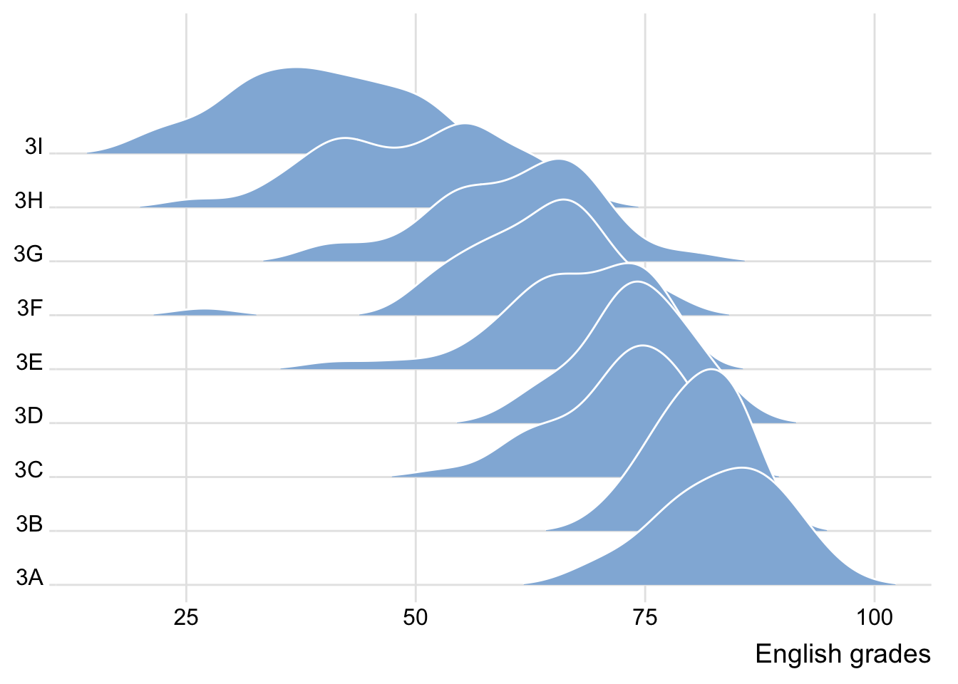
2.2 Varying fill colors along the x axis
Enhance the ridgeline plot by filling the ridges based on the x-axis values.
ggplot(exam,
       aes(x = ENGLISH,
           y = CLASS,
           fill = stat(x))) +
  geom_density_ridges_gradient(
    scale = 3,
    rel_min_height = 0.01) +
  scale_fill_viridis_c(name = "Temp. [F]",
                       option = "C") +
  scale_x_continuous(
    name = "English grades",
    expand = c(0, 0)
  ) +
  scale_y_discrete(name = NULL, expand = expansion(add = c(0.2, 2.6))) +
  theme_ridges()
Warning: `stat(x)` was deprecated in ggplot2 3.4.0.
ℹ Please use `after_stat(x)` instead.Picking joint bandwidth of 3.18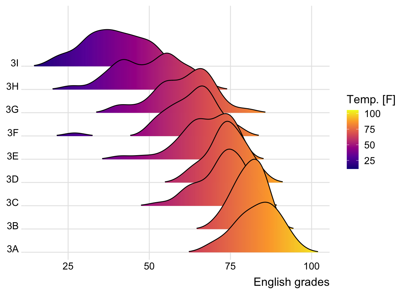
Warning
The warning message we are seeing is because the stat(x) syntax has been deprecated in ggplot2 version 3.4.0 and above. The recommended alternative is to use after_stat(x).
Below is the revised code:
ggplot(exam,
       aes(x = ENGLISH,
           y = CLASS,
           fill = after_stat(x))) +
  geom_density_ridges_gradient(
    scale = 3,
    rel_min_height = 0.01) +
  scale_fill_viridis_c(name = "Temp. [F]",
                       option = "C") +
  scale_x_continuous(
    name = "English grades",
    expand = c(0, 0)
  ) +
  scale_y_discrete(name = NULL, expand = expansion(add = c(0.2, 2.6))) +
  theme_ridges()
Picking joint bandwidth of 3.18
2.3 Mapping the probabilities directly onto colour
Map the probabilities directly onto the fill colors using ECDF, creating a gradient color effect.
ggplot(exam,
       aes(x = ENGLISH,
           y = CLASS,
           fill = 0.5 - abs(0.5-stat(ecdf)))) +
  stat_density_ridges(geom = "density_ridges_gradient",
                      calc_ecdf = TRUE) +
  scale_fill_viridis_c(name = "Tail probability",
                       direction = -1) +
  theme_ridges()
Picking joint bandwidth of 3.18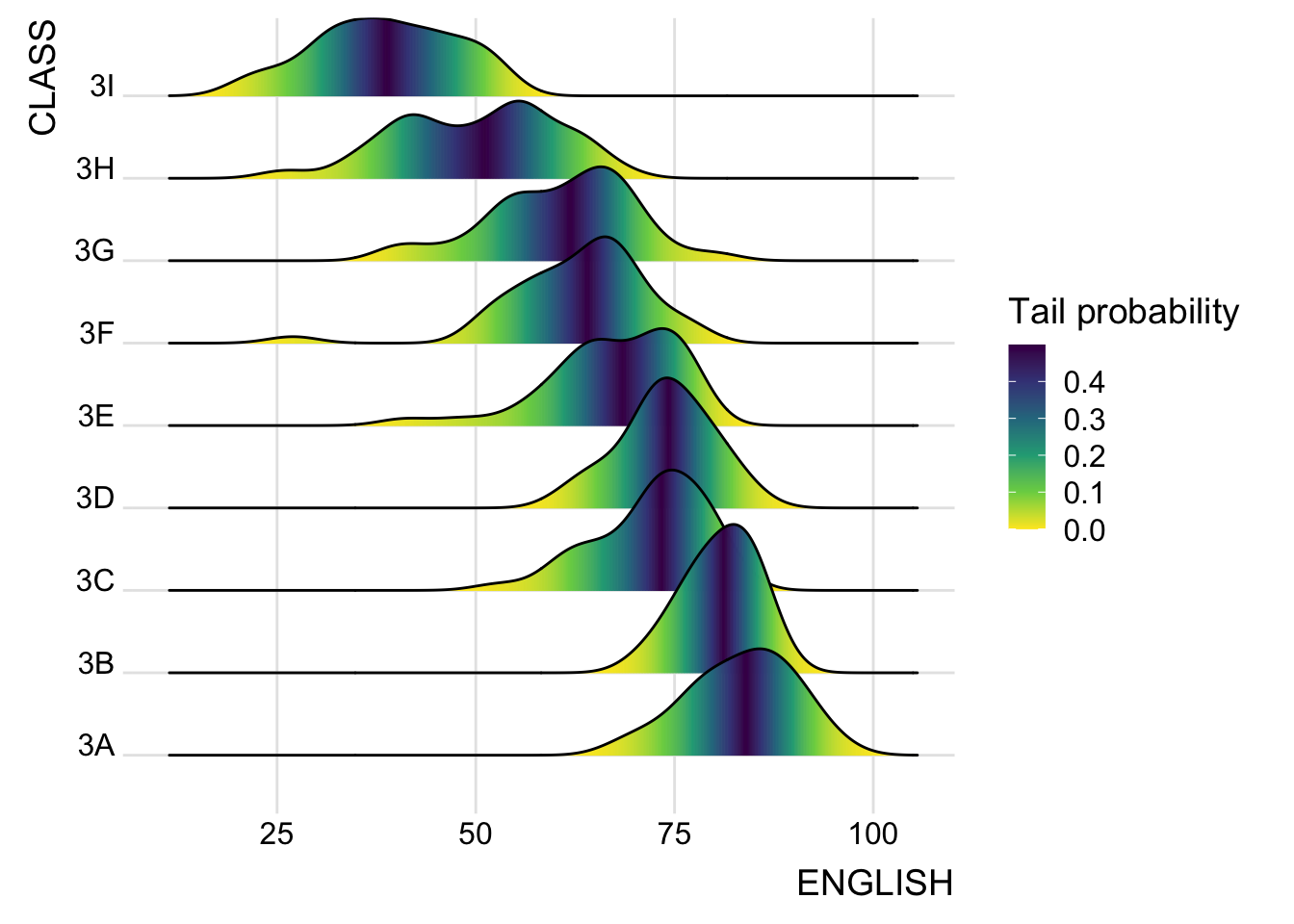
2.4 Ridgeline plots with quantile lines
Add quantile lines to the ridgeline plot to visualize quartiles.
ggplot(exam,
       aes(x = ENGLISH,
           y = CLASS,
           fill = factor(stat(quantile))
           )) +
  stat_density_ridges(
    geom = "density_ridges_gradient",
    calc_ecdf = TRUE,
    quantiles = 4,
    quantile_lines = TRUE) +
  scale_fill_viridis_d(name = "Quartiles") +
  theme_ridges()
Picking joint bandwidth of 3.18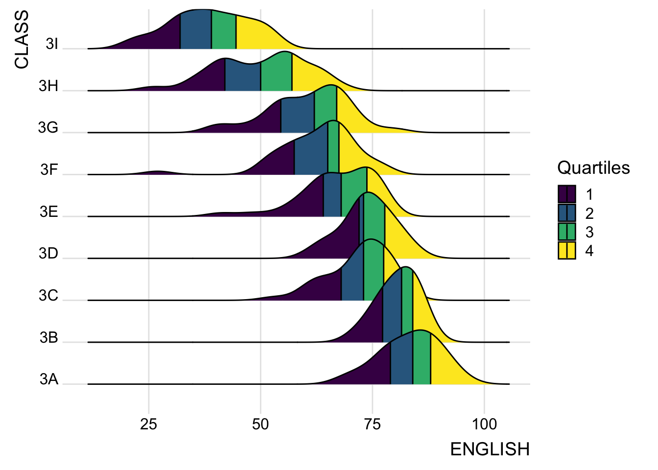
3. Visualising Distribution with Raincloud Plot
3.1 Plotting a Half Eye graph
This section introduces the Raincloud Plot, a combination of density plot, box plot, and scatter plot (dots).
We use
stat_halfeye()to create a visually rich representation of distribution.
ggplot(exam,
       aes(x = RACE,
           y = ENGLISH)) +
  stat_halfeye(adjust = 0.5,
               justification = -0.2,
               .width = 0,
               point_colour = NA)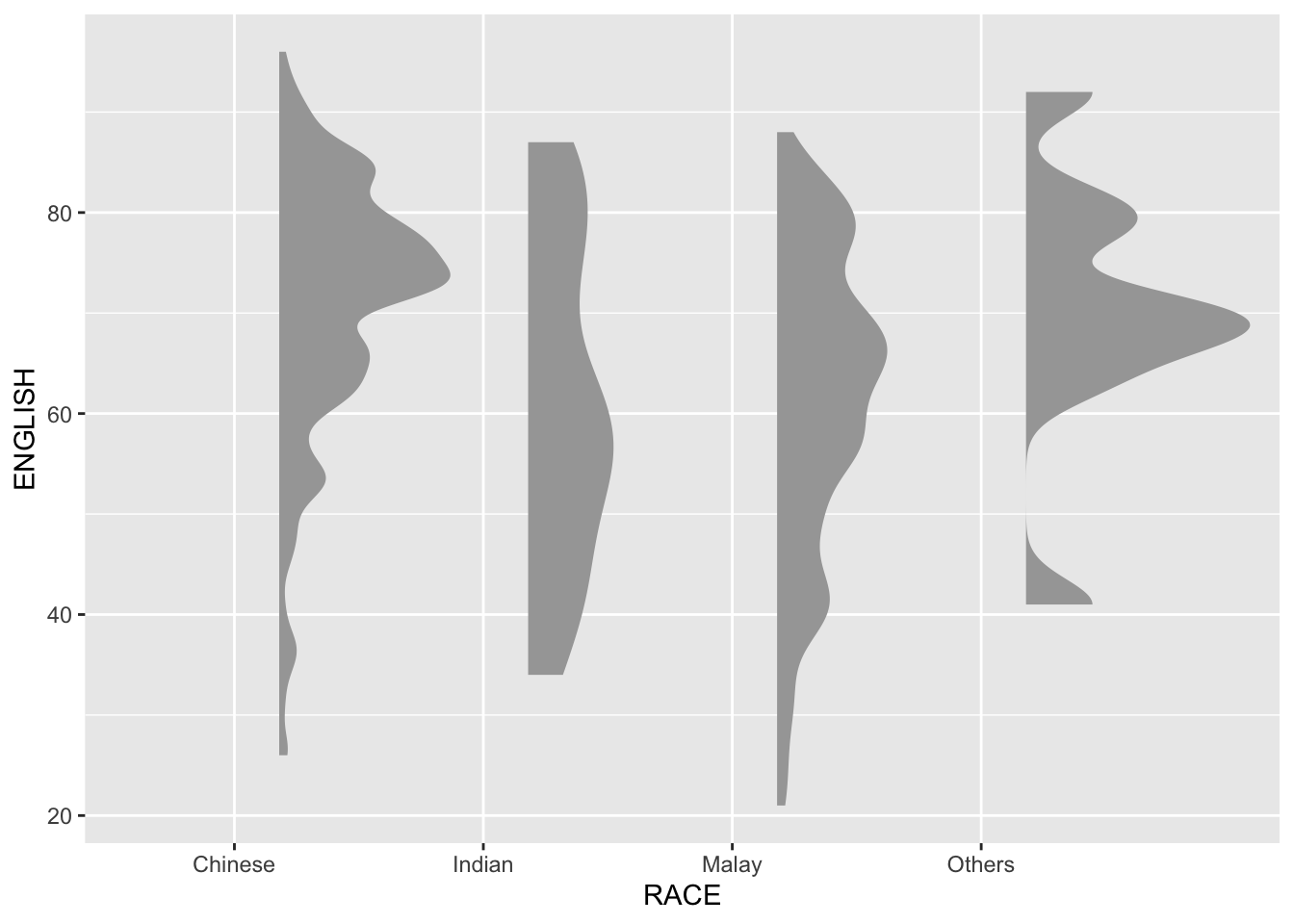
3.2 Adding the boxplot with geom_boxplot()
Combine the half-eye graph with a boxplot to provide a clearer view of score distribution and central tendency.
ggplot(exam,
       aes(x = RACE,
           y = ENGLISH)) +
  stat_halfeye(adjust = 0.5,
               justification = -0.2,
               .width = 0,
               point_colour = NA) +
  geom_boxplot(width = .20,
               outlier.shape = NA)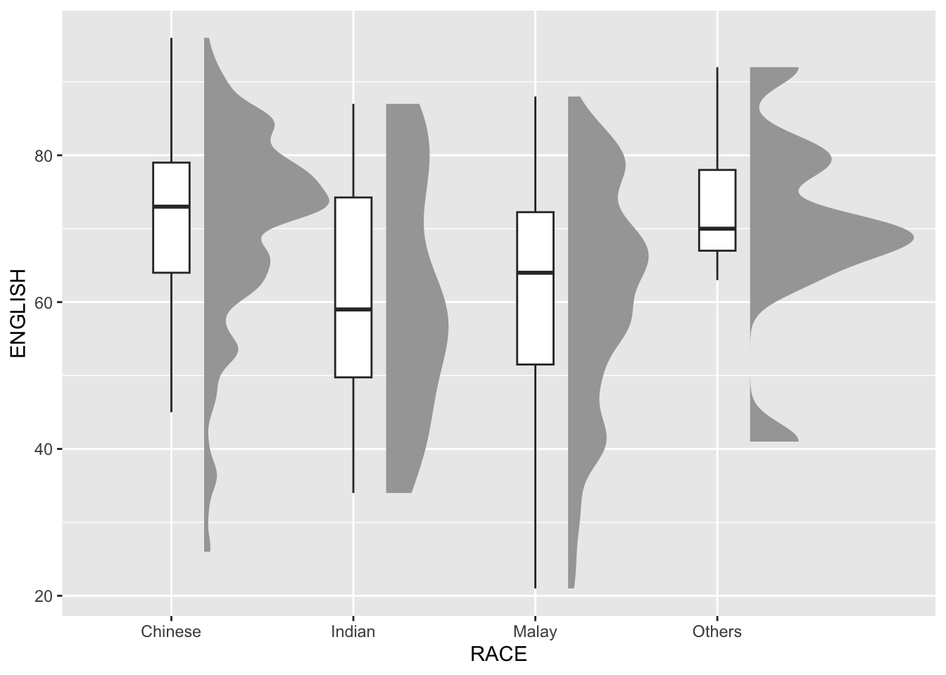
3.3 Adding the Dot Plots with stat_dots()
Enhance the visualization by adding dot plots to showcase individual data points.
ggplot(exam,
       aes(x = RACE,
           y = ENGLISH)) +
  stat_halfeye(adjust = 0.5,
               justification = -0.2,
               .width = 0,
               point_colour = NA) +
  geom_boxplot(width = .20,
               outlier.shape = NA) +
  stat_dots(side = "left",
            justification = 1.2,
            binwidth = .5,
            dotsize = 2)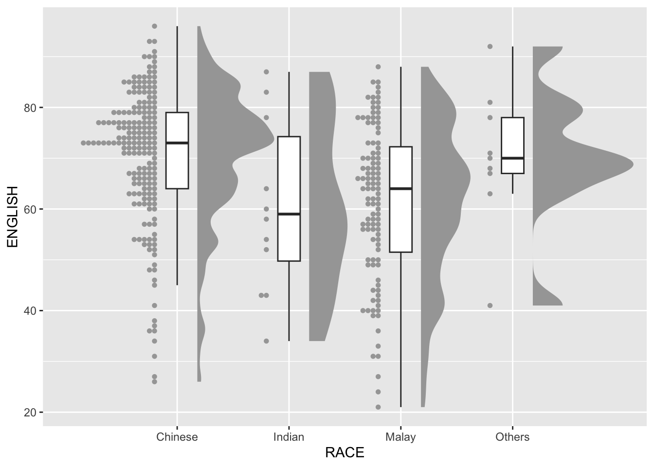
3.4 Finishing touch
Finalize the raincloud plot by adjusting orientation and applying a clean theme.
ggplot(exam,
       aes(x = RACE,
           y = ENGLISH)) +
  stat_halfeye(adjust = 0.5,
               justification = -0.2,
               .width = 0,
               point_colour = NA) +
  geom_boxplot(width = .20,
               outlier.shape = NA) +
  stat_dots(side = "left",
            justification = 1.2,
            binwidth = .5,
            dotsize = 1.5) +
  coord_flip() +
  theme_economist()
Warning: The provided binwidth will cause dots to overflow the boundaries of the
geometry.
→ Set `binwidth = NA` to automatically determine a binwidth that ensures dots
fit within the bounds,
→ OR set `overflow = "compress"` to automatically reduce the spacing between
dots to ensure the dots fit within the bounds,
→ OR set `overflow = "keep"` to allow dots to overflow the bounds of the
geometry without producing a warning.
ℹ For more information, see the documentation of the `binwidth` and `overflow`
arguments of `?ggdist::geom_dots()` or the section on constraining dot sizes
in vignette("dotsinterval") (`vignette(ggdist::dotsinterval)`).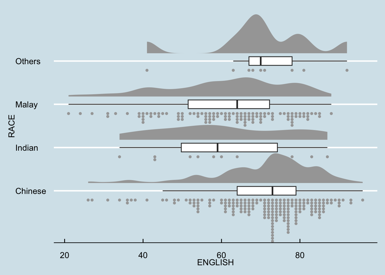
Warning
The warning we are seeing is because the stat_dots() function in the ggplot2 code is trying to fit dots within a limited space, but the specified binwidth and dotsize cause the dots to overflow the available area.
We try the solution below (set binwidth = NA) to let ggdist automatically calculate the best binwidth.
ggplot(exam,
       aes(x = RACE,
           y = ENGLISH)) +
  stat_halfeye(adjust = 0.5,
               justification = -0.2,
               .width = 0,
               point_colour = NA) +
  geom_boxplot(width = .20,
               outlier.shape = NA) +
  stat_dots(side = "left",
            justification = 1.2,
            binwidth = NA,   # Automatically adjusts binwidth
            dotsize = 1.5) +
  coord_flip() +
  theme_economist()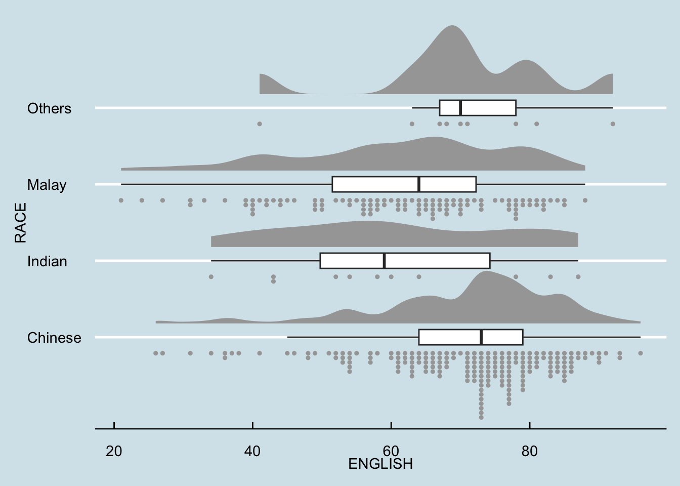
Part 2: Visual Statistical Analysis
1. Getting Started
1.1 Installing and launching R packages
We load packages for statistical analysis using ggstatsplot and tidyverse.
pacman::p_load(ggstatsplot, tidyverse)1.2 Importing Data
We re-import the exam data for analysis.
exam <- read_csv("data/Exam_data.csv")Rows: 322 Columns: 7
── Column specification ────────────────────────────────────────────────────────
Delimiter: ","
chr (4): ID, CLASS, GENDER, RACE
dbl (3): ENGLISH, MATHS, SCIENCE
ℹ Use `spec()` to retrieve the full column specification for this data.
ℹ Specify the column types or set `show_col_types = FALSE` to quiet this message.2 One-sample test: gghistostats() method
A one-sample test is used to determine if the average English scores in the dataset are significantly different from a test value of 60.
We use the gghistostats function from ggstatsplot, specifying:
Data: The exam dataset.
Variable: ENGLISH scores.
Test Type: Bayesian (type = “bayes”).
Test Value: 60, representing the threshold for comparison.
set.seed(1234)

gghistostats(
  data = exam,
  x = ENGLISH,
  type = "bayes",
  test.value = 60,
  xlab = "English scores"
)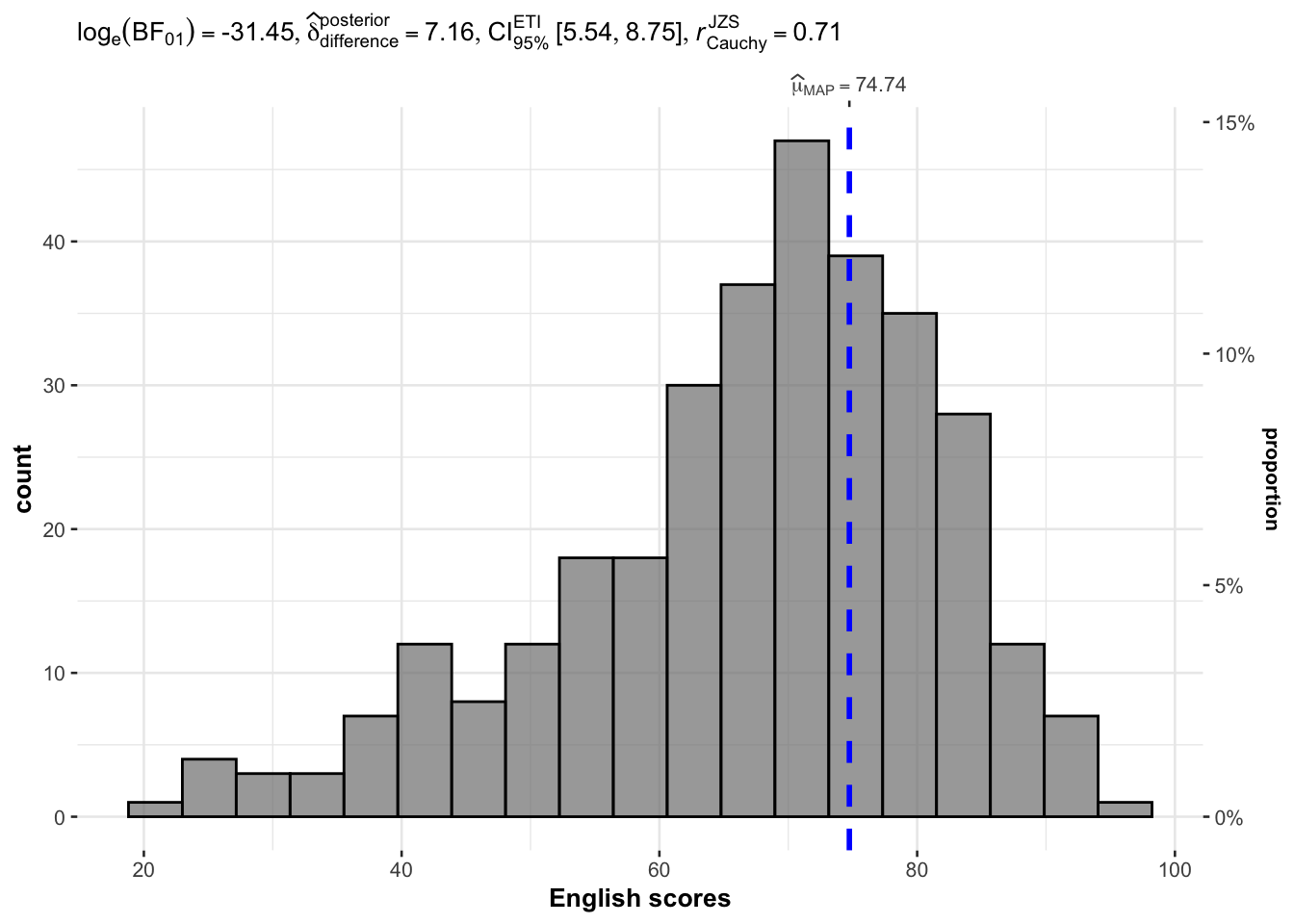
Analysis:
The histogram with overlaid Bayesian distribution allows visual assessment of score distribution.
The test result indicates whether the mean English score is statistically different from 60.
3 Two-sample mean test: ggbetweenstats()
This test compares the average Math scores between two groups: Male and Female.
Non-parametric test (type = “np”) is used due to the nature of the data distribution.
ggbetweenstats(
  data = exam,
  x = GENDER,
  y = MATHS,
  type = "np",
  messages = FALSE
)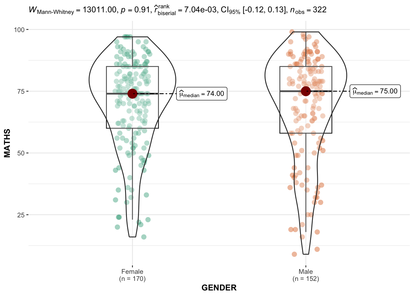
Analysis:
The boxplot shows the distribution of Math scores between genders.
Significance testing directly indicates if the difference between the two groups is statistically meaningful.
4 Oneway ANOVA Test: ggbetweenstats() method
This test compares English scores among different racial groups.
ANOVA (Analysis of Variance) is applied, followed by pairwise comparisons between groups.
ggbetweenstats(
  data = exam,
  x = RACE,
  y = ENGLISH,
  type = "p",
  mean.ci = TRUE,
  pairwise.comparisons = TRUE,
  pairwise.display = "s",
  p.adjust.method = "fdr",
  messages = FALSE
)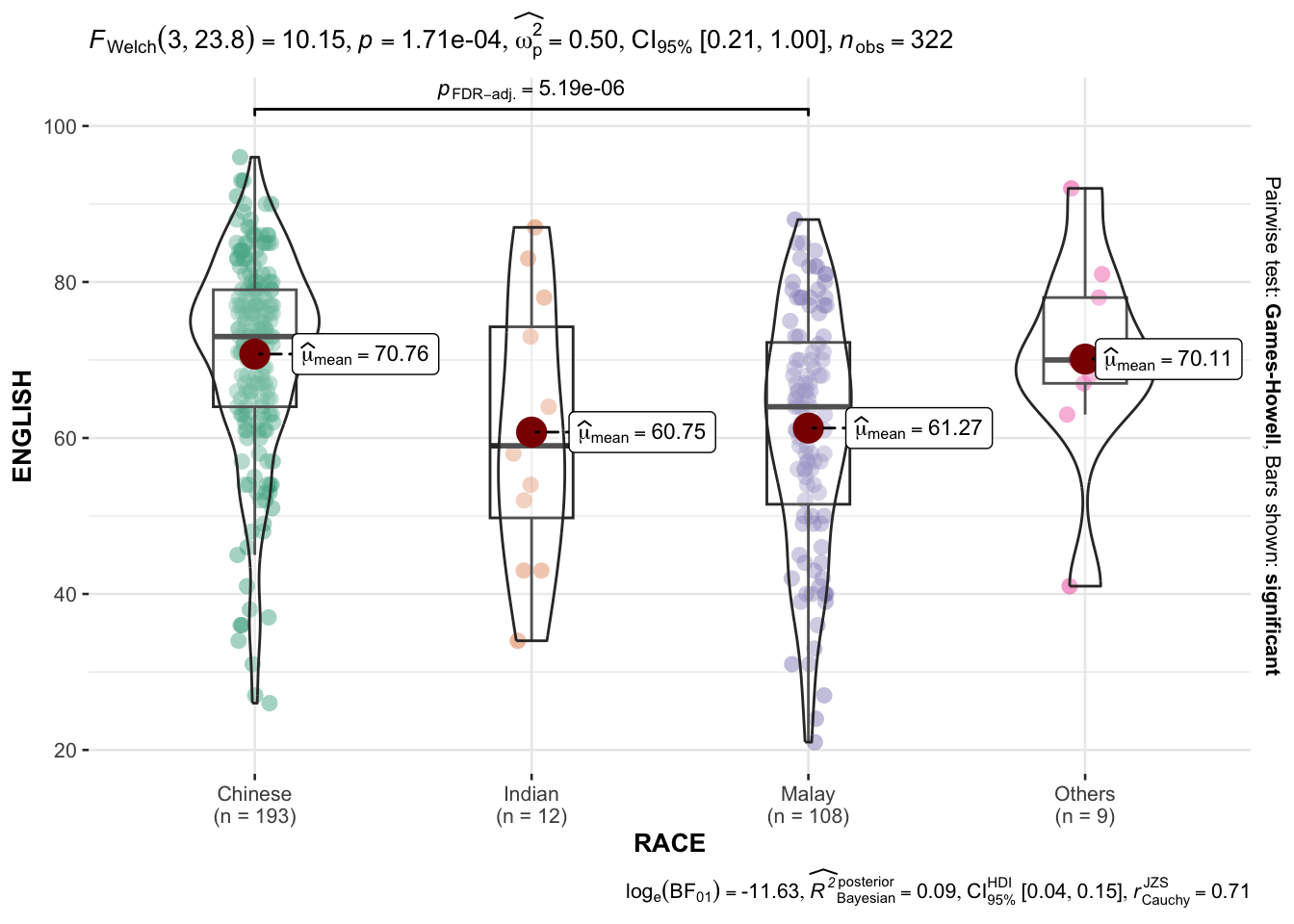
Analysis:
The ANOVA test identifies significant differences in English scores among racial groups.
Pairwise comparisons provide insight into which groups differ significantly.
4.1 Significant Test of Correlation: ggscatterstats()
This test explores the relationship between Math and English scores using scatter plot visualization.
ggscatterstats(
  data = exam,
  x = MATHS,
  y = ENGLISH,
  marginal = FALSE,
  )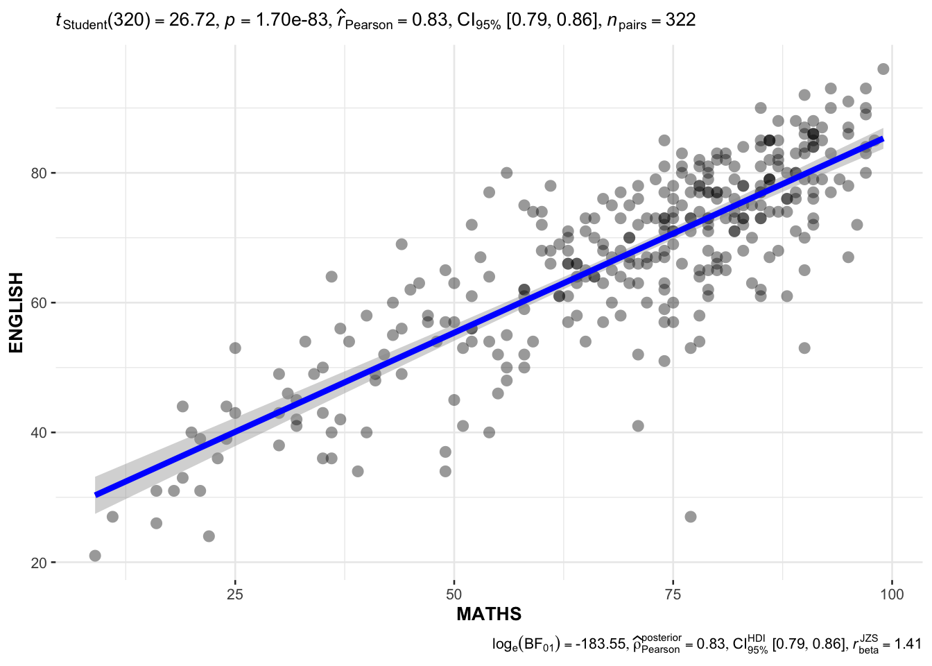
Analysis:
A scatter plot with correlation statistics visualizes the relationship between Math and English scores.
4.2 Significant Test of Association (Depedence) : ggbarstats() methods
This test examines the association between Math score ranges (categorized) and Gender.
exam1 <- exam %>%
  mutate(MATHS_bins =
           cut(MATHS,
               breaks = c(0,60,75,85,100))
)
In this code chunk below ggbarstats() is used to build a visual for Significant Test of Association
ggbarstats(exam1,
           x = MATHS_bins,
           y = GENDER)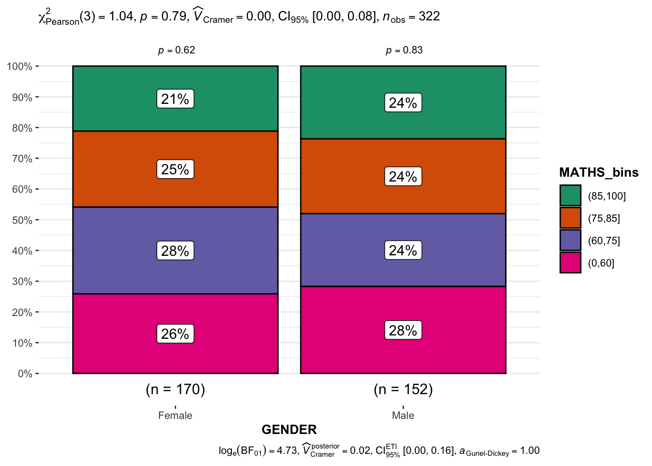
Analysis:
The bar chart visualizes the distribution of genders across different Math score categories.
The test reveals whether Math performance categories are associated with gender distribution.
Part 3: Visualising Uncertainty
1. Getting Started
This section focuses on visualizing uncertainty in statistical estimates using various methods in R. Understanding and effectively visualizing uncertainty is essential for making informed decisions based on data, as it highlights the range of possible outcomes.
1.1 Installing and loading the packages
We use several R packages designed for advanced data visualization:
plotly: For creating interactive plots.
crosstalk: Enables shared data between multiple visualizations.
DT: Creates interactive data tables.
ggdist: A powerful package for visualizing uncertainty, including point and gradient intervals.
ggridges: For creating ridgeline plots.
colorspace: For enhanced color management.
gganimate: For creating animated visualizations.
tidyverse: A collection of packages for data manipulation and visualization.
pacman::p_load(plotly, crosstalk, DT,
               ggdist, ggridges, colorspace,
               gganimate, tidyverse)
1.2 Data import
We load the “Exam_data.csv” dataset, which contains test scores for different races. This dataset will be used to demonstrate various methods of visualizing uncertainty.
exam <- read_csv("data/Exam_data.csv")Rows: 322 Columns: 7
── Column specification ────────────────────────────────────────────────────────
Delimiter: ","
chr (4): ID, CLASS, GENDER, RACE
dbl (3): ENGLISH, MATHS, SCIENCE
ℹ Use `spec()` to retrieve the full column specification for this data.
ℹ Specify the column types or set `show_col_types = FALSE` to quiet this message.2. Visualizing the uncertainty of point estimates: ggplot2 methods
2.1 Calculating Summary Statistics
We first calculate key summary statistics:
n: Number of students in each race group.
mean: Average math score for each race.
sd: Standard deviation of math scores for each race.
se: Standard error of the mean
my_sum <- exam %>%
  group_by(RACE) %>%
  summarise(
    n=n(),
    mean=mean(MATHS),
    sd=sd(MATHS)
    ) %>%
  mutate(se=sd/sqrt(n-1))
2.2 Displaying Summary Statistics
We display the calculated statistics in a neat table format for easy understanding.
knitr::kable(head(my_sum), format = 'html')| RACE | n | mean | sd | se |
|---|---|---|---|---|
| Chinese | 193 | 76.50777 | 15.69040 | 1.132357 |
| Indian | 12 | 60.66667 | 23.35237 | 7.041005 |
| Malay | 108 | 57.44444 | 21.13478 | 2.043177 |
| Others | 9 | 69.66667 | 10.72381 | 3.791438 |
3. Visualizing Uncertainty with Error Bars
3.1 Plotting standard error bars of point estimates
We use geom_errorbar to visualize standard errors around the mean for each race group.
Red dots represent the mean values.
ggplot(my_sum) +
  geom_errorbar(
    aes(x=RACE,
        ymin=mean-se,
        ymax=mean+se),
    width=0.2,
    colour="black",
    alpha=0.9,
    linewidth=0.5) +
  geom_point(aes
           (x=RACE,
            y=mean),
           stat="identity",
           color="red",
           size = 1.5,
           alpha=1) +
  ggtitle("Standard error of mean maths score by rac")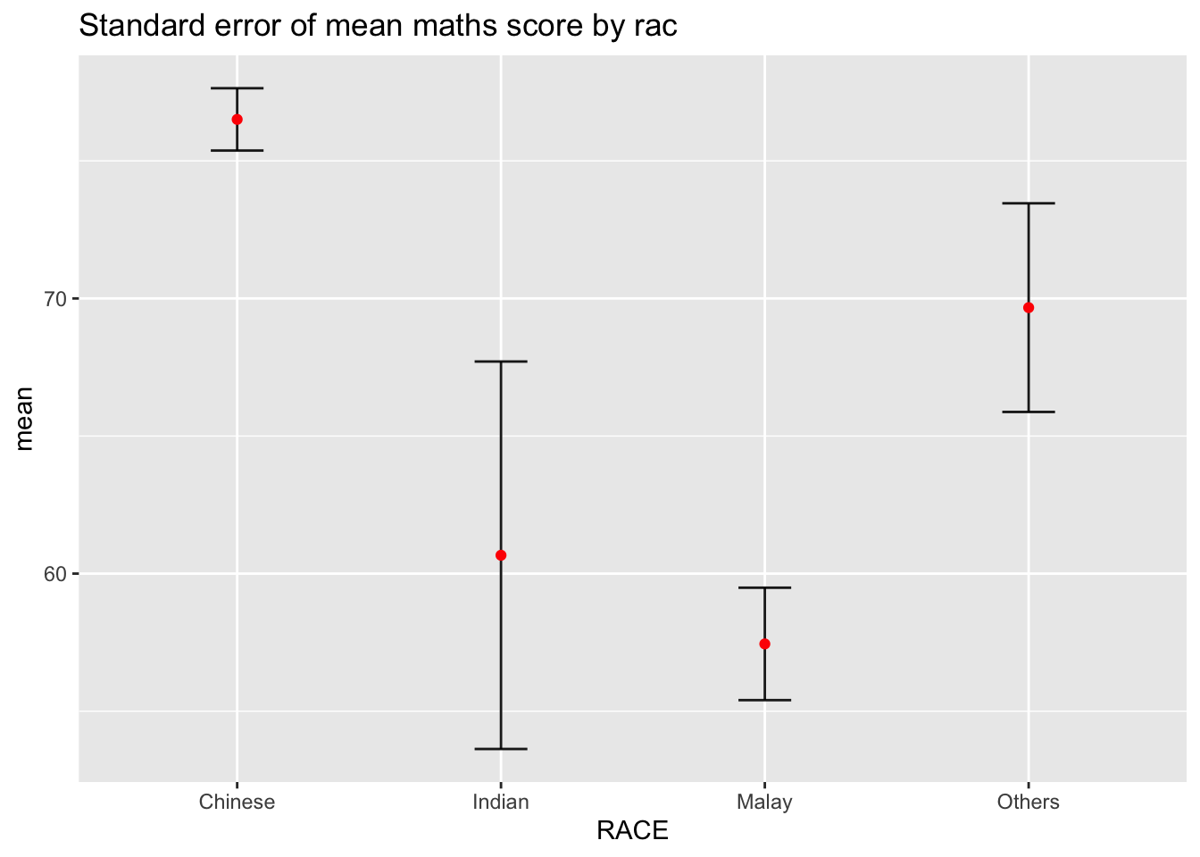
3.2 Confidence Interval (95%)
We modify the error bars to show 95% confidence intervals.
ggplot(my_sum) +
  geom_errorbar(
    aes(x=reorder(RACE, -mean),
        ymin=mean-1.96*se,
        ymax=mean+1.96*se),
    width=0.2,
    colour="black",
    alpha=0.9,
    linewidth=0.5) +
  geom_point(aes
           (x=RACE,
            y=mean),
           stat="identity",
           color="red",
           size = 1.5,
           alpha=1) +
  labs(x = "Maths score",
       title = "95% confidence interval of mean maths score by race")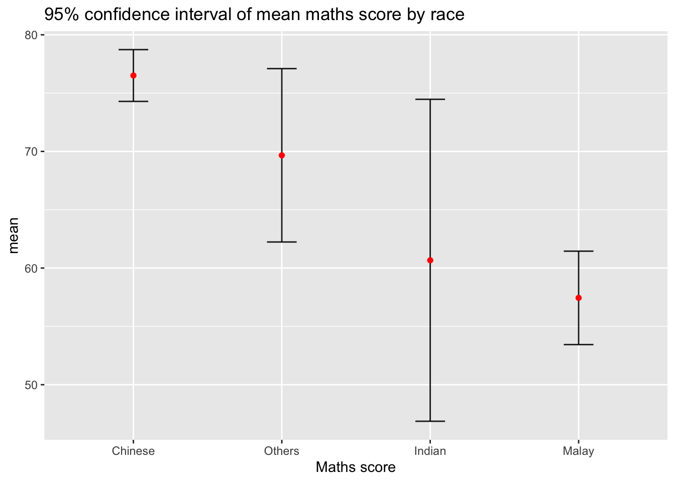
4. Interactive Error Bars with Plotly
4.1 Creating Interactive Error Bars
We convert the static confidence interval plot into an interactive plot using Plotly.
Hovering over each point displays additional information, such as race, sample size, average score, and confidence interval.
shared_df = SharedData$new(my_sum)

bscols(widths = c(4,8),
       ggplotly((ggplot(shared_df) +
                   geom_errorbar(aes(
                     x=reorder(RACE, -mean),
                     ymin=mean-2.58*se,
                     ymax=mean+2.58*se),
                     width=0.2,
                     colour="black",
                     alpha=0.9,
                     size=0.5) +
                   geom_point(aes(
                     x=RACE,
                     y=mean,
                     text = paste("Race:", `RACE`,
                                  "<br>N:", `n`,
                                  "<br>Avg. Scores:", round(mean, digits = 2),
                                  "<br>95% CI:[",
                                  round((mean-2.58*se), digits = 2), ",",
                                  round((mean+2.58*se), digits = 2),"]")),
                     stat="identity",
                     color="red",
                     size = 1.5,
                     alpha=1) +
                   xlab("Race") +
                   ylab("Average Scores") +
                   theme_minimal() +
                   theme(axis.text.x = element_text(
                     angle = 45, vjust = 0.5, hjust=1)) +
                   ggtitle("99% Confidence interval of average /<br>maths scores by race")),
                tooltip = "text"),
       DT::datatable(shared_df,
                     rownames = FALSE,
                     class="compact",
                     width="100%",
                     options = list(pageLength = 10,
                                    scrollX=T),
                     colnames = c("No. of pupils",
                                  "Avg Scores",
                                  "Std Dev",
                                  "Std Error")) %>%
         formatRound(columns=c('mean', 'sd', 'se'),
                     digits=2))
Warning: Using `size` aesthetic for lines was deprecated in ggplot2 3.4.0.
ℹ Please use `linewidth` instead.Warning in geom_point(aes(x = RACE, y = mean, text = paste("Race:", RACE, :
Ignoring unknown aesthetics: text
Warning
The warning messages we are seeing can be resolved by making two adjustments to the code:
Change
sizetolinewidthfor Lines:The
sizeaesthetic forgeom_errorbaris deprecated inggplot23.4.0 and above.Replace
sizewithlinewidthfor the error bars.Correct the
textAesthetic ingeom_point:The
textaesthetic is not directly recognized bygeom_point() inggplot2.Instead, we need to use tooltip inside
ggplotly() to display text in tooltips.
Please find the update code chunk:
shared_df = SharedData$new(my_sum)

bscols(
  widths = c(4, 8),
  ggplotly(
    ggplot(shared_df) +
      geom_errorbar(
        aes(
          x = reorder(RACE, -mean),
          ymin = mean - 2.58 * se,
          ymax = mean + 2.58 * se
        ),
        width = 0.2,
        colour = "black",
        alpha = 0.9,
        linewidth = 0.5  # Changed from size to linewidth
      ) +
      geom_point(
        aes(
          x = RACE,
          y = mean
        ),
        color = "red",
        size = 1.5,
        alpha = 1
      ) +
      xlab("Race") +
      ylab("Average Scores") +
      theme_minimal() +
      theme(
        axis.text.x = element_text(angle = 45, vjust = 0.5, hjust = 1)
      ) +
      ggtitle("99% Confidence Interval of Average Maths Scores by Race"),
    tooltip = "text"
  ),
  DT::datatable(
    shared_df,
    rownames = FALSE,
    class = "compact",
    width = "100%",
    options = list(pageLength = 10, scrollX = TRUE),
    colnames = c("No. of pupils", "Avg Scores", "Std Dev", "Std Error")
  ) %>%
    formatRound(columns = c('mean', 'sd', 'se'), digits = 2)
)
5. Visualizing Uncertainty with ggdist
5.1 Point Interval Plots
We use the ggdist package to create enhanced point interval plots, which display multiple confidence intervals (95% and others) around the mean or median.
exam %>%
  ggplot(aes(x = RACE,
             y = MATHS)) +
  stat_pointinterval() +
  labs(
    title = "Visualising confidence intervals of mean math score",
    subtitle = "Mean Point + Multiple-interval plot")
5.2 Gradient Interval Plots
A gradient interval plot uses color gradients to represent uncertainty visually.
exam %>%
  ggplot(aes(x = RACE, y = MATHS)) +
  stat_pointinterval(.width = 0.95,
  .point = median,
  .interval = qi) +
  labs(
    title = "Visualising confidence intervals of median math score",
    subtitle = "Median Point + Multiple-interval plot")
Warning in layer_slabinterval(data = data, mapping = mapping, stat =
StatPointinterval, : Ignoring unknown parameters: `.point` and `.interval`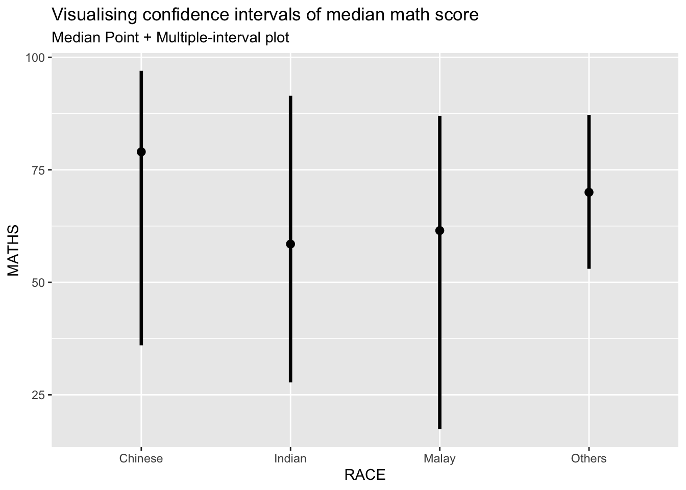
Warning
The warning we are seeing is because the parameters .point and .interval are not recognized by stat_pointinterval() in our version of ggplot2 or the ggdist package. These parameters are used in older versions or may require a slightly different syntax.
We use the code chunk below to fix this warning:
Instead of using .point and .interval, we use the
point_intervalfunction directly within thestat_pointinterval()to specify the type of interval we want.For a median point with a 95% confidence interval, use
point_interval = median_qidirectly.
exam %>%
  ggplot(aes(x = RACE, y = MATHS)) +
  stat_pointinterval(
    point_interval = median_qi,  # Using median_qi for median and 95% CI
    .width = 0.95
  ) +
  labs(
    title = "Visualizing Confidence Intervals of Median Math Score",
    subtitle = "Median Point + 95% Interval Plot"
  ) +
  theme_minimal()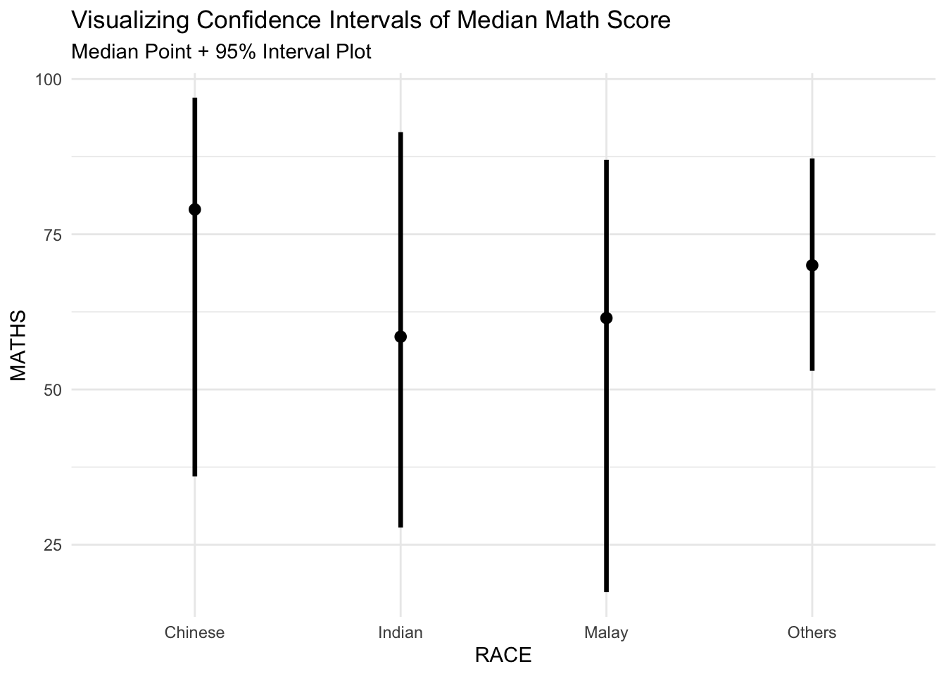
5.3 Visualizing the uncertainty of point estimates: ggdistmethods
exam %>%
  ggplot(aes(x = RACE,
             y = MATHS)) +
  stat_pointinterval(
    show.legend = FALSE) +
  labs(
    title = "Visualising confidence intervals of mean math score",
    subtitle = "Mean Point + Multiple-interval plot")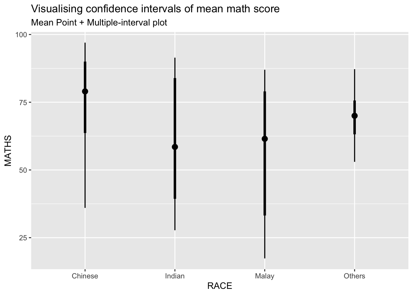
5.4 Visualizing the uncertainty of point estimates: ggdistmethods
exam %>%
  ggplot(aes(x = RACE,
             y = MATHS)) +
  stat_gradientinterval(
    fill = "skyblue",
    show.legend = TRUE
  ) +
  labs(
    title = "Visualising confidence intervals of mean math score",
    subtitle = "Gradient + interval plot")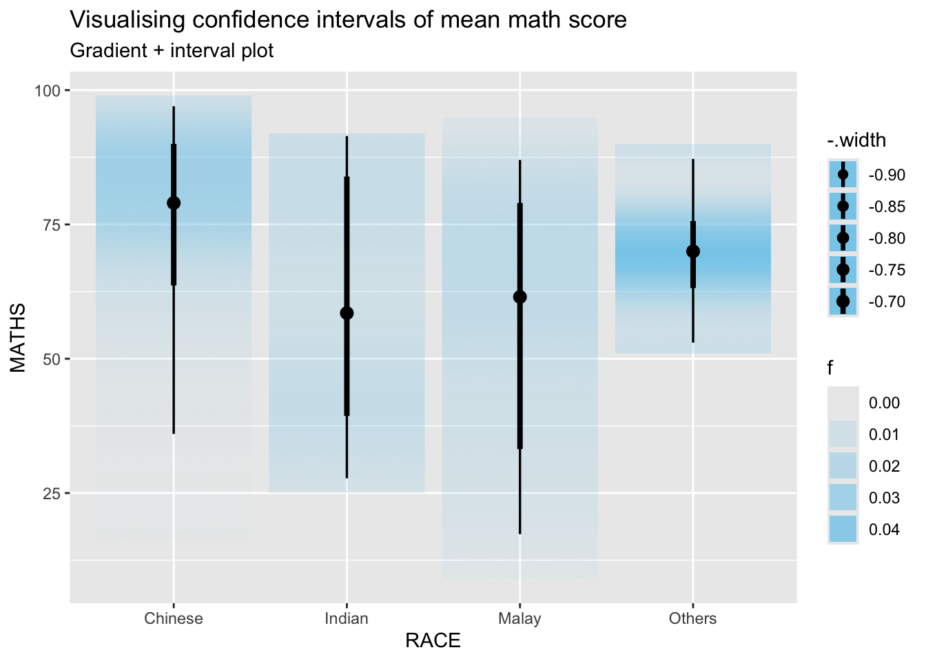
6. Visualising Uncertainty with Hypothetical Outcome Plots (HOPs)
6.1 Installing ungeviz package
Hypothetical Outcome Plots (HOPs) are a powerful tool for visualizing uncertainty in data. They simulate multiple possible outcomes, providing a visual representation of variability.
We use the ungeviz package to create HOPs in this section.
devtools::install_github("wilkelab/ungeviz")Using github PAT from envvar GITHUB_PAT. Use `gitcreds::gitcreds_set()` and unset GITHUB_PAT in .Renviron (or elsewhere) if you want to use the more secure git credential store instead.Skipping install of 'ungeviz' from a github remote, the SHA1 (74e1651b) has not changed since last install.
Use `force = TRUE` to force installation6.1.1 Launch the application in R
library(ungeviz)6.2 Visualising Uncertainty with Hypothetical Outcome Plots (HOPs)
We use a scatter plot with jitter to display individual data points (Math scores by race).
The geom_hpline function adds horizontal lines representing hypothetical outcomes (HOPs) simulated for each group.
ggplot(data = exam,
       (aes(x = factor(RACE),
            y = MATHS))) +
  geom_point(position = position_jitter(
    height = 0.3,
    width = 0.05),
    size = 0.4,
    color = "#0072B2",
    alpha = 1/2) +
  geom_hpline(data = sampler(25,
                             group = RACE),
              height = 0.6,
              color = "#D55E00") +
  theme_bw() +
  transition_states(.draw, 1, 3)
Warning in geom_hpline(data = sampler(25, group = RACE), height = 0.6, color =
"#D55E00"): Ignoring unknown parameters: `height`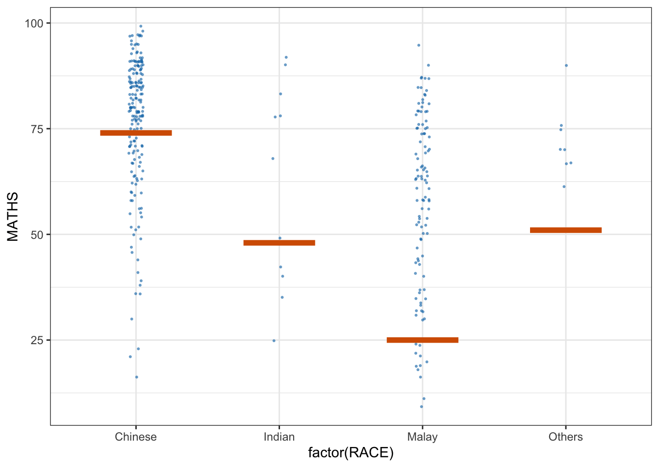
Part 4: Funnel Plots for Fair Comparisons
1. Getting Started
This section introduces the concept of funnel plots, which are a valuable tool for fair comparisons between groups, particularly in healthcare and quality control settings. A funnel plot visually displays variations between groups while accounting for differences in sample sizes, helping to distinguish between normal and abnormal variations.
1.1 Installing and Launching R Packages
This section introduces FunnelPlotR, a package for creating funnel plots that allow for fair comparisons between groups.
Packages Used:
tidyverse: A collection of R packages for data manipulation and visualization.FunnelPlotR: A package specifically designed to create funnel plots in R.plotly: For creating interactive visualizations.knitr: For document rendering and reporting.
pacman::p_load(tidyverse, FunnelPlotR, plotly, knitr,ggrepel)1.2 Importing Data
We load the “COVID-19_DKI_Jakarta.csv” dataset, which contains COVID-19 statistics for various sub-districts in Jakarta.
The
mutate_iffunction is used to ensure all character columns are converted to factors, which is useful for categorical analysis.
covid19 <- read_csv("data/COVID-19_DKI_Jakarta.csv") %>%
  mutate_if(is.character, as.factor)
Rows: 267 Columns: 7
── Column specification ────────────────────────────────────────────────────────
Delimiter: ","
chr (3): City, District, Sub-district
dbl (4): Sub-district ID, Positive, Recovered, Death
ℹ Use `spec()` to retrieve the full column specification for this data.
ℹ Specify the column types or set `show_col_types = FALSE` to quiet this message.2. FunnelPlotR methods: The basic plot
The first funnel plot is generated using the funnel_plot function from the FunnelPlotR package.
This plot compares the number of positive COVID-19 cases (numerator) to deaths (denominator) across different sub-districts.
funnel_plot(
  .data = covid19,
  numerator = Positive,
  denominator = Death,
  group = `Sub-district`
)
A funnel plot object with 267 points of which 0 are outliers.
Plot is adjusted for overdispersion.
3. FunnelPlotR methods: Enhanced Versions
3.1 Makeover 1: Parameter Adjustments
We switch the numerator and denominator, making it a proportion ratio (PR) funnel plot.
The x-axis and y-axis ranges are customized to improve clarity.
funnel_plot(
  .data = covid19,
  numerator = Death,
  denominator = Positive,
  group = `Sub-district`,
  data_type = "PR",     #<<
  xrange = c(0, 6500),  #<<
  yrange = c(0, 0.05)   #<<
)
Warning: The `xrange` argument deprecated; please use the `x_range` argument
instead. For more options, see the help: `?funnel_plot`Warning: The `yrange` argument deprecated; please use the `y_range` argument
instead. For more options, see the help: `?funnel_plot`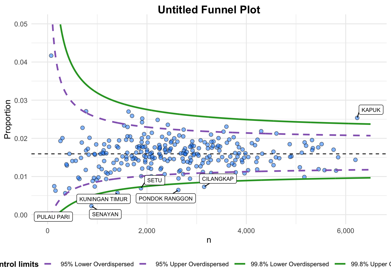
A funnel plot object with 267 points of which 7 are outliers.
Plot is adjusted for overdispersion.
Warning
The warning indicates that the arguments xrange and yrange are deprecated in the funnel_plot() function.
They have been replaced with:
• x_range instead of xrange
• y_range instead of yrange
Updated code chunk:
funnel_plot(
  .data = covid19,
  numerator = Death,
  denominator = Positive,
  group = `Sub-district`,
  data_type = "PR",
  x_range = c(0, 6500),  # Corrected from xrange to x_range
  y_range = c(0, 0.05)   # Corrected from yrange to y_range
)
A funnel plot object with 267 points of which 7 are outliers.
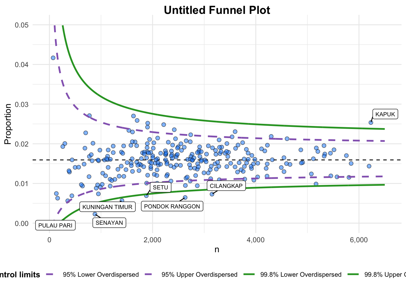
Plot is adjusted for overdispersion. 3.2 Makeover 2: Further Customization
The plot title and axis labels are customized to enhance clarity.
Labels are removed for a cleaner look.
funnel_plot(
  .data = covid19,
  numerator = Death,
  denominator = Positive,
  group = `Sub-district`,
  data_type = "PR",
  xrange = c(0, 6500),
  yrange = c(0, 0.05),
  label = NA,
  title = "Cumulative COVID-19 Fatality Rate by Cumulative Total Number of COVID-19 Positive Cases", #<<
  x_label = "Cumulative COVID-19 Positive Cases", #<<
  y_label = "Cumulative Fatality Rate"  #<<
)
Warning: The `xrange` argument deprecated; please use the `x_range` argument
instead. For more options, see the help: `?funnel_plot`Warning: The `yrange` argument deprecated; please use the `y_range` argument
instead. For more options, see the help: `?funnel_plot`
A funnel plot object with 267 points of which 7 are outliers.
Plot is adjusted for overdispersion.
Same for the previous section, using the updated code chunk below to resolve the warning:
funnel_plot(
  .data = covid19,
  numerator = Death,
  denominator = Positive,
  group = `Sub-district`,
  data_type = "PR",
  x_range = c(0, 6500),   # Corrected from xrange to x_range
  y_range = c(0, 0.05),   # Corrected from yrange to y_range
  label = NA,
  title = "Cumulative COVID-19 Fatality Rate by Cumulative Total Number of COVID-19 Positive Cases",
  x_label = "Cumulative COVID-19 Positive Cases",
  y_label = "Cumulative Fatality Rate"
)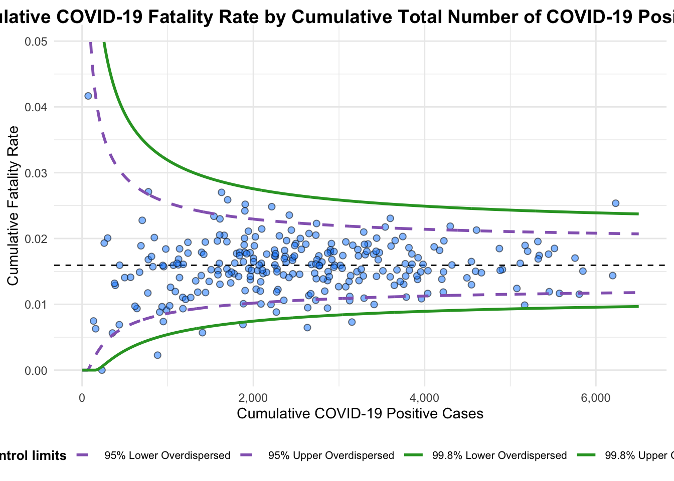
A funnel plot object with 267 points of which 7 are outliers.
Plot is adjusted for overdispersion.
4. Funnel Plot for Fair Visual Comparison: ggplot2 methods
4.1 Data Preparation
We calculate the fatality rate (deaths per positive case) and the standard error for each sub-district.
Filtering is applied to exclude sub-districts with zero rates.
df <- covid19 %>%
  mutate(rate = Death / Positive) %>%
  mutate(rate.se = sqrt((rate*(1-rate)) / (Positive))) %>%
  filter(rate > 0)
4.2 Calculating Confidence Intervals
Using weighted mean to get the average rate for the funnel plot.
Calculating 95% and 99.9% confidence limits using the standard error.
fit.mean <- weighted.mean(df$rate, 1/df$rate.se^2)number.seq <- seq(1, max(df$Positive), 1)
number.ll95 <- fit.mean - 1.96 * sqrt((fit.mean*(1-fit.mean)) / (number.seq))
number.ul95 <- fit.mean + 1.96 * sqrt((fit.mean*(1-fit.mean)) / (number.seq))
number.ll999 <- fit.mean - 3.29 * sqrt((fit.mean*(1-fit.mean)) / (number.seq))
number.ul999 <- fit.mean + 3.29 * sqrt((fit.mean*(1-fit.mean)) / (number.seq))
dfCI <- data.frame(number.ll95, number.ul95, number.ll999,
number.ul999, number.seq, fit.mean)5. Creating Static Funnel Plot with ggplot2
A static funnel plot is generated using ggplot2, displaying:
Data points for each sub-district.
Confidence intervals (95% and 99.9%) as dashed and solid lines.
The overall average rate as a horizontal line.
p <- ggplot(df, aes(x = Positive, y = rate)) +
  geom_point(aes(label=`Sub-district`),
             alpha=0.4) +
  geom_line(data = dfCI,
            aes(x = number.seq,
                y = number.ll95),
            size = 0.4,
            colour = "grey40",
            linetype = "dashed") +
  geom_line(data = dfCI,
            aes(x = number.seq,
                y = number.ul95),
            size = 0.4,
            colour = "grey40",
            linetype = "dashed") +
  geom_line(data = dfCI,
            aes(x = number.seq,
                y = number.ll999),
            size = 0.4,
            colour = "grey40") +
  geom_line(data = dfCI,
            aes(x = number.seq,
                y = number.ul999),
            size = 0.4,
            colour = "grey40") +
  geom_hline(data = dfCI,
             aes(yintercept = fit.mean),
             size = 0.4,
             colour = "grey40") +
  coord_cartesian(ylim=c(0,0.05)) +
  annotate("text", x = 1, y = -0.13, label = "95%", size = 3, colour = "grey40") +
  annotate("text", x = 4.5, y = -0.18, label = "99%", size = 3, colour = "grey40") +
  ggtitle("Cumulative Fatality Rate by Cumulative Number of COVID-19 Cases") +
  xlab("Cumulative Number of COVID-19 Cases") +
  ylab("Cumulative Fatality Rate") +
  theme_light() +
  theme(plot.title = element_text(size=12),
        legend.position = c(0.91,0.85),
        legend.title = element_text(size=7),
        legend.text = element_text(size=7),
        legend.background = element_rect(colour = "grey60", linetype = "dotted"),
        legend.key.height = unit(0.3, "cm"))
Warning in geom_point(aes(label = `Sub-district`), alpha = 0.4): Ignoring
unknown aesthetics: labelWarning: A numeric `legend.position` argument in `theme()` was deprecated in ggplot2
3.5.0.
ℹ Please use the `legend.position.inside` argument of `theme()` instead.p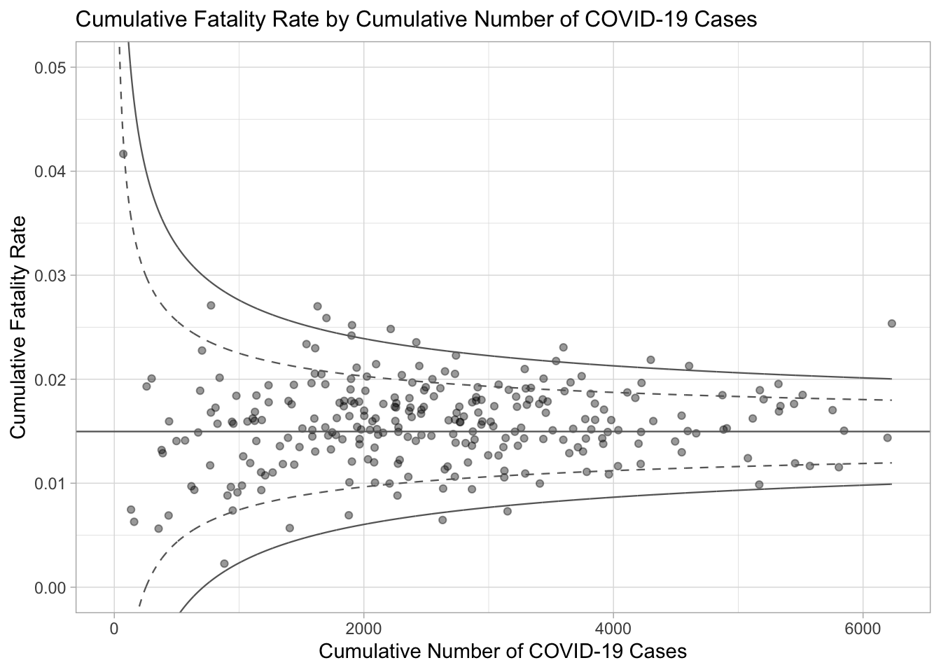
Warning
Understanding the Warnings:
Warning: Unknown Aesthetic label in
geom_point()• The label aesthetic in
geom_point()is not recognized because it is not a valid aesthetic for points.• The correct approach is to use
geom_text()orgeom_text_repel()(fromggrepelpackage) for text labels.Warning: Numeric legend.position is Deprecated
• Direct numeric coordinates for legend.position are deprecated.
• We should use the legend.position.inside argument with a list of c(x, y) values.
Updated code chunk:
p <- ggplot(df, aes(x = Positive, y = rate)) +
  # Points without label aesthetic
  geom_point(alpha = 0.4) +
  # Adding text labels using geom_text_repel
  geom_text_repel(aes(label = `Sub-district`),
                  size = 3,
                  color = "grey40",
                  max.overlaps = 15) +
  # Confidence intervals (95% and 99%)
  geom_line(data = dfCI, aes(x = number.seq, y = number.ll95),
            size = 0.4, colour = "grey40", linetype = "dashed") +
  geom_line(data = dfCI, aes(x = number.seq, y = number.ul95),
            size = 0.4, colour = "grey40", linetype = "dashed") +
  geom_line(data = dfCI, aes(x = number.seq, y = number.ll999),
            size = 0.4, colour = "grey40") +
  geom_line(data = dfCI, aes(x = number.seq, y = number.ul999),
            size = 0.4, colour = "grey40") +
  geom_hline(data = dfCI, aes(yintercept = fit.mean),
             size = 0.4, colour = "grey40") +
  coord_cartesian(ylim = c(0, 0.05)) +
  annotate("text", x = 1, y = 0.045, label = "95%", size = 3, colour = "grey40") +
  annotate("text", x = 4.5, y = 0.045, label = "99%", size = 3, colour = "grey40") +
  ggtitle("Cumulative Fatality Rate by Cumulative Number of COVID-19 Cases") +
  xlab("Cumulative Number of COVID-19 Cases") +
  ylab("Cumulative Fatality Rate") +
  theme_light() +
  theme(
    plot.title = element_text(size = 12),
    legend.position = "right",  # Adjusted for better control
    legend.title = element_text(size = 7),
    legend.text = element_text(size = 7),
    legend.background = element_rect(colour = "grey60", linetype = "dotted"),
    legend.key.height = unit(0.3, "cm")
  )

p
Warning: ggrepel: 226 unlabeled data points (too many overlaps). Consider
increasing max.overlaps
6. Interactive Funnel Plot: plotly + ggplot2
We convert the static ggplot into an interactive plot using Plotly.
Hover tooltips display additional information, making it more user-friendly.
fp_ggplotly <- ggplotly(p,
  tooltip = c("label",
              "x",
              "y"))
Warning in geom2trace.default(dots[[1L]][[1L]], dots[[2L]][[1L]], dots[[3L]][[1L]]): geom_GeomTextRepel() has yet to be implemented in plotly.
If you'd like to see this geom implemented,
Please open an issue with your example code at
https://github.com/ropensci/plotly/issuesfp_ggplotlySummary
In this exercise, we explored various advanced methods to visualize data distributions in R, including:
Ridgeline and Raincloud plots for distribution visualization.
Statistical analysis with
ggstatsplot.Visualizing uncertainty using
ggdist,plotly, andgganimate.Funnel plots for fair comparisons using
FunnelPlotR.
These techniques provide a comprehensive toolkit for exploring and presenting data in a visually intuitive manner.